Before simply answering "there is such a font", I would like to seriously suggest you should not differentiate a dot and a slash. The reasons are:
Many Chinese people don't distinguish them when writing, even calligraphers. We care about "fast" and "beautiful".
The standard glyphs among mainland, Taiwan/Hong Kong, Japan and Korea, are usually different, you can't tell which one is the most authoritative.
If anyway you need a computer font to do such analyses, check
標楷體 and 國字標準字體 for traditional Chinese. This font (edukai-3.ttf, title: TW-MOE-Std-Kai) can be downloaded from the website of Ministry Of Education of Taiwan.
微软简楷体 for simplified Chinese. This font (simkai.ttf, title: 楷体. Offered by ZHONGYI Electronic Co., Beijing) is the default Kai font in MS Windows for simplified Chinese. Note that though it is named "simplified Kai", it includes traditional characters.
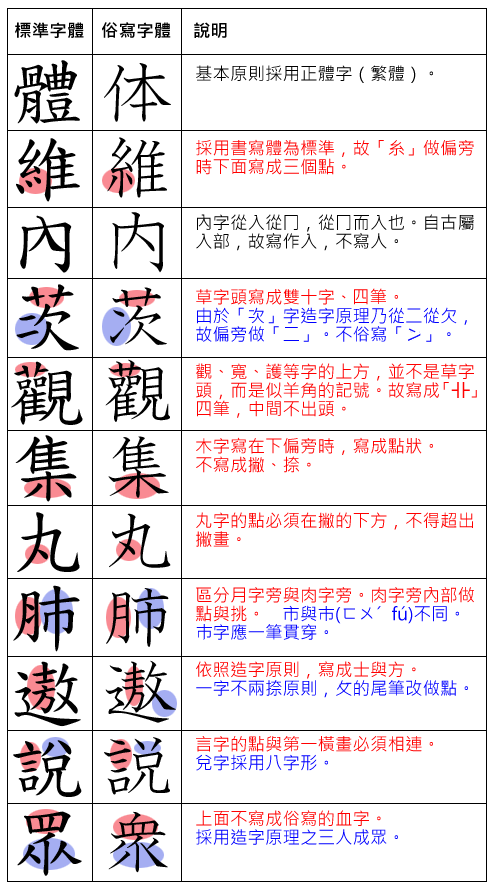
In the examples of the wiki page 國字標準字體, the first column is "standard" and the second is "conventional" (both should be considered correct):

Some distinction of a dot and a slash is highlighted (維, 內, 集, 遨, 說, 眾). Yes, I should also mention even in Taiwan many scholars criticize this standard, "sometimes it departs from convention too much". And I've never ever seen any native speaker strictly follows such a standard when they are writing.
Other minor differences can be also found, see the comparison (微, 標):

I guess you can figure it out :) So, I'm afraid it's better not to differentiate a dot and a slash in a "character system".

