If you're not too concerned about aesthetics, and more about functional cursive balancing your own writing speed and other people's reading comprehension, just build upon regular script stroke orders.

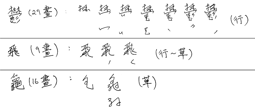
「鬱」, written in 7 strokes;「飛」, written in 3 strokes;「龜」, written in 2 strokes.
You have to re-order some regular script stroke orders, focusing on the following:
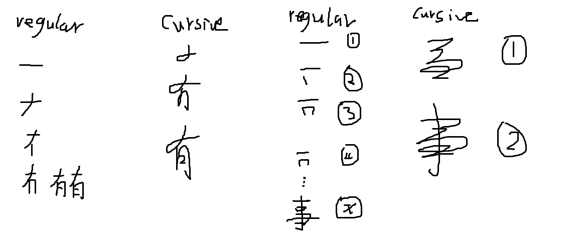
- Abbreviate dense part of characters with a generic scribble which can capture the outline. The detail and exact shape of highly dense portions of characters does not impede reading comprehension.
- Think carefully about where the next part of the character starts, and try to reorder the strokes to minimise pen movement.
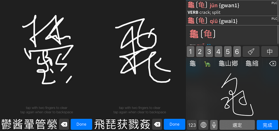
I suggest using a semi-cursive to cursive style rather than a fully cursive style, like the example of「龜」above. If other people and standard handwriting recognition programs can read your writing, then you're doing something right.

Semi-cursive works okay for Pleco handwriting (「鬱」and「飛」). Full cursive does not (「龜」), but Apple's handwriting recognition does a fairly good job.
