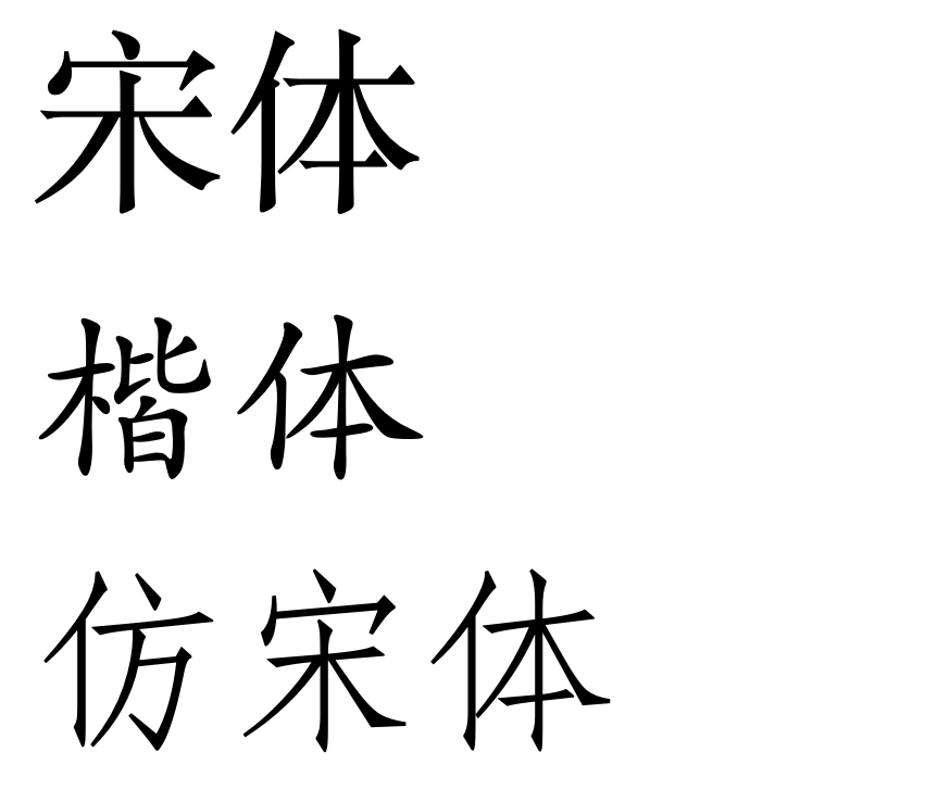
Chinese script has no concept of “italics”. Of course, it is possible to slant characters, but – as you state – this is not a very professional solution. Given that you main body font is 宋体 (Songti, the equivalent to a serif font for Latin characters probably), it is a good idea to use another style like 楷体 (Kaiti) or 仿宋体 (Fangsongti). I personally like the latter, but because the Kaiti style is heavier, it will be probably more likely be perceived as different than the Fangsongti style which is not that heavy. To my knowledge, a Kaiti style is used more often than Fangsongti in Chinese printed matter (at least in books).
All these styles are available from very different vendors. So, it is actually up to you to choose a nice combination. The fonts below are „Songti SC“ (which I like better than the older „STSong“), „Kaiti SC“ and „STFangsong“ that all ship with the current macOS and are designed by Changzhou SinoType Technology Co., Ltd.
From top to bottom: Songti, Kaiti, Fangsongti.

However, switching between fonts is probably only a good idea if you start a new paragraph, because it may be difficult for the reader to recognise the font change. For emphasis of single words, you could use a heavier font (粗体, bold) or you could use emphasis points, which are small dots placed under (or in vertical typography to the right of) the relevant characters. However, emphasis points are – at least to my knowledge – used only rarely and it may be difficult to typeset them depending on the software you use.


