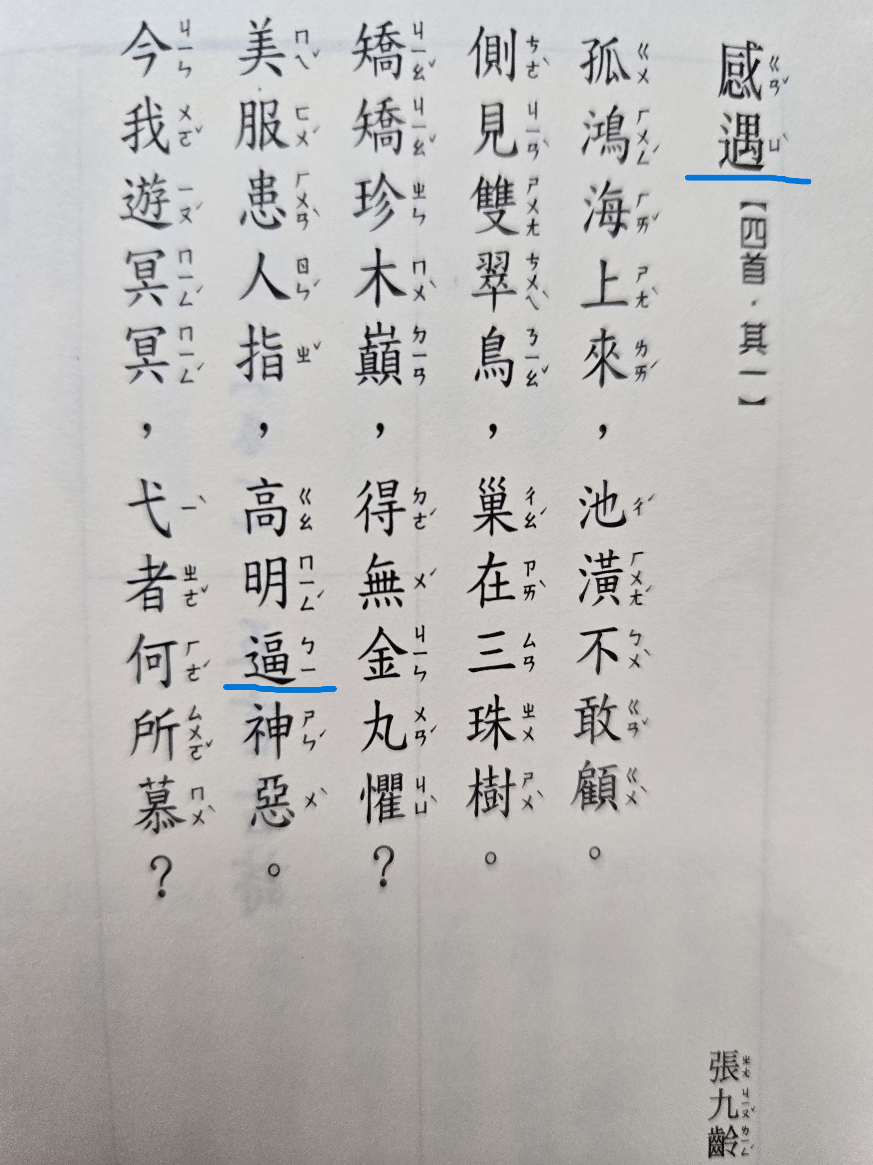
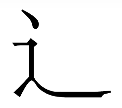
When writing characters with the "walk" radical, sometimes I saw it with one dot, sometimes I saw the version with two dots, are there any differences? Is there a convention of the choice between the two? See below example:
-
1Terminology nit - "radicals" are dictionary organisation tools. The shape in question 「⻍」 is a character component first and foremost. Whether a dictionary uses this component as a radical is secondary.– dROOOzeCommented Sep 15 at 10:05
-
I wonder where does this page come from, it seems that it uses standards in Mainland, HK and TW in a same page.– Tec99Commented Sep 15 at 10:16
-
@Tec99 It's from a book named "300 Tang poems" I bought in TW, I thought it's in TW standard. What elements on the page are from Mainland and HK?– fluterCommented Sep 15 at 12:13
3 Answers
That walk component is an abbreviation of the full form 「辵」, which is a combination of 「彳」 (left half of 「行」, picture of a road intersection, and 「止・龰」, picture of a foot > walking, movement). See, for example, the glyph evolution sequence of 「過」 (to pass through, semantic 「辵」 walk and phonetic 「咼」):
西周
金
過伯簋
集成3907楚
簡
語叢3
郭店楚簡秦
簡
效律9
睡虎地秦簡東漢
隸
華山廟碑
清
明體
康熙字典
楷
The "dots" originate from the top strokes of 「彳」.
Where you're seeing a discrepancy, it's more than just the number of dots.
Firstly, there is a curl in the handwritten shape. The two-dots, one-dot, curl, etc. is just the merger region between 「彳」 and 「止」.
Secondly, take note that in modern practice, 2-dots is on orthodox print shapes (Ming Typefaces); these are print forms, which means that it is less common to handwrite these forms. In standard handwriting, imitate regular script - the last shape in the glyph evolution sequence above.
There is a final shape that appears in print material from Mainland China and Japan. This is a further non-orthodox abbreviation of the forms from before - you should never ever write like this.
-
Is it odd that different shapes appears in the same book, even on the same page?– fluterCommented Sep 22 at 8:38
-
@fluter It's not odd that a MIng Typeface font appears in the same page as Regular Script font. For example, Chinese novels may use Regular Script in the midst of Ming Typeface, where an English book may use quotation emphasis instead. The different shapes of 「⻍」 merely occur because one of them appears in a Ming Typeface font and the other one appears in Regular Script font.– dROOOzeCommented Sep 22 at 8:45
sometimes I saw it with one dot, sometimes I saw the version with two dots
well, about the radical 162 “辵”, there’re difference amongst china, taiwan & hong kong; further, even in traditional chinese, there’re difference between taiwan & hong kong:
⻌
this one is considered as simplified character, used in china
⻎
this one is considered as traditional chinese, used in hong kong
⻍
this one is considered as traditional chinese, used in taiwan
as usual, the above is according to regular script only, and, there’re exceptions amongst operation system, applications & fonts selected 😼
this wiki page has more info, in details:
-
-
@Tec99, no, you made a mistake lah 🙀 in hong kong, the one dot ⻎ is the norm google.com/… freeguider.com/upload/venues/185/518/big/…– 水巷孑蠻Commented Sep 15 at 11:45
-
@Tec99, or the site of 全港運動會: the logo, and, if you choose traditional chinese, all “運” is displayed with a one dot ⻎ hongkonggames.hk/hkg2024/tc.html– 水巷孑蠻Commented Sep 15 at 12:02
-
Actually in the site of 全港運動會 there's also two dot 辶. It seems that HK often uses diffrent standards (like 綫 and 線), but I'm sure TW use one-dot 辶, as their official dictionary use it. dict.concised.moe.edu.tw/search.jsp?md=1&word=%E9%81%87 moedict.tw/%E9%81%87 (the second one isn't official site but it is based on official dictionary and is better than the official site)– Tec99Commented Sep 16 at 3:40
-
@Tec99, the provided wiki mentioned: “Windows附帶的細明體及新細明體(MingLiU、PMingLiU)在5.03版以前使用兩點的「⻍」,Windows Vista及以後的系統附帶的字形才改用一點的「⻎」。由於並無強制規範,實際印刷時,台灣除少數出版商使用國字標準字體外,**大多數仍然沿用兩點的傳承字形「⻍」**,視覺上較為勻稱。”– 水巷孑蠻Commented Sep 16 at 5:29
In most modern standards of Chinese fonts in computer (including the standard used in Mainland China and TW, also Japan), 走之底(辶) has only one dot. It seems that in Korean standard the computer font of 走之底 has two dot. I'm not sure in HK, for they seems to use both standards.
in ancient time, the printing font had two dots, while both one dot and two dots exist in handwriting, but eventually one dot become more popular, so it becomes the standard now.
Their are also some discussion about it in China. Here are some reference (which I used to write the answer):


